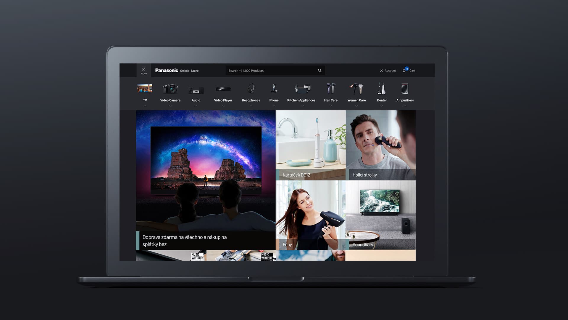
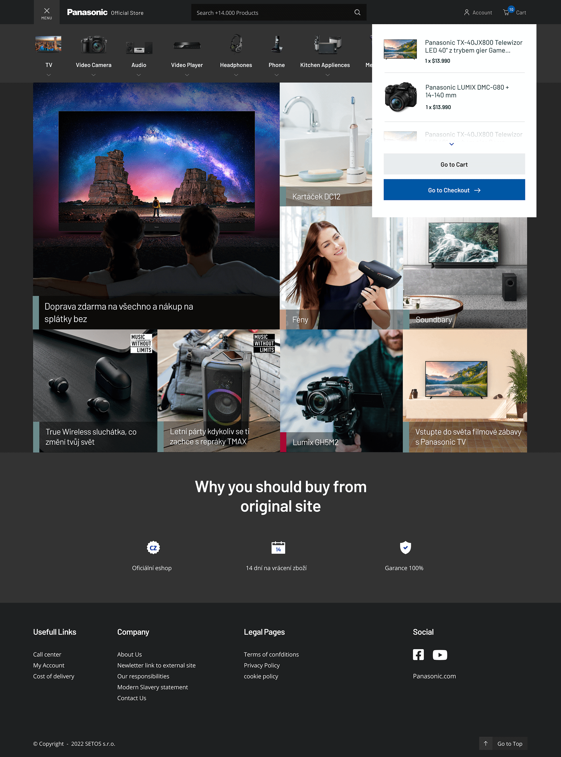
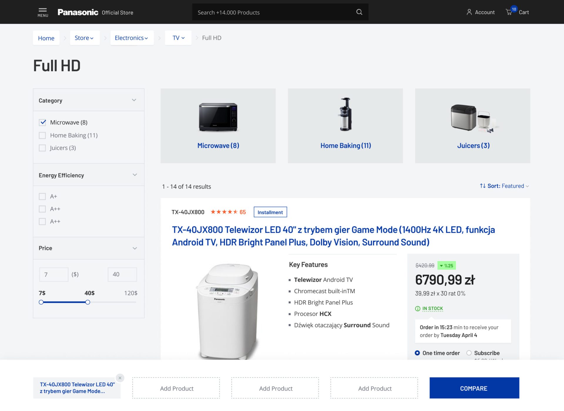
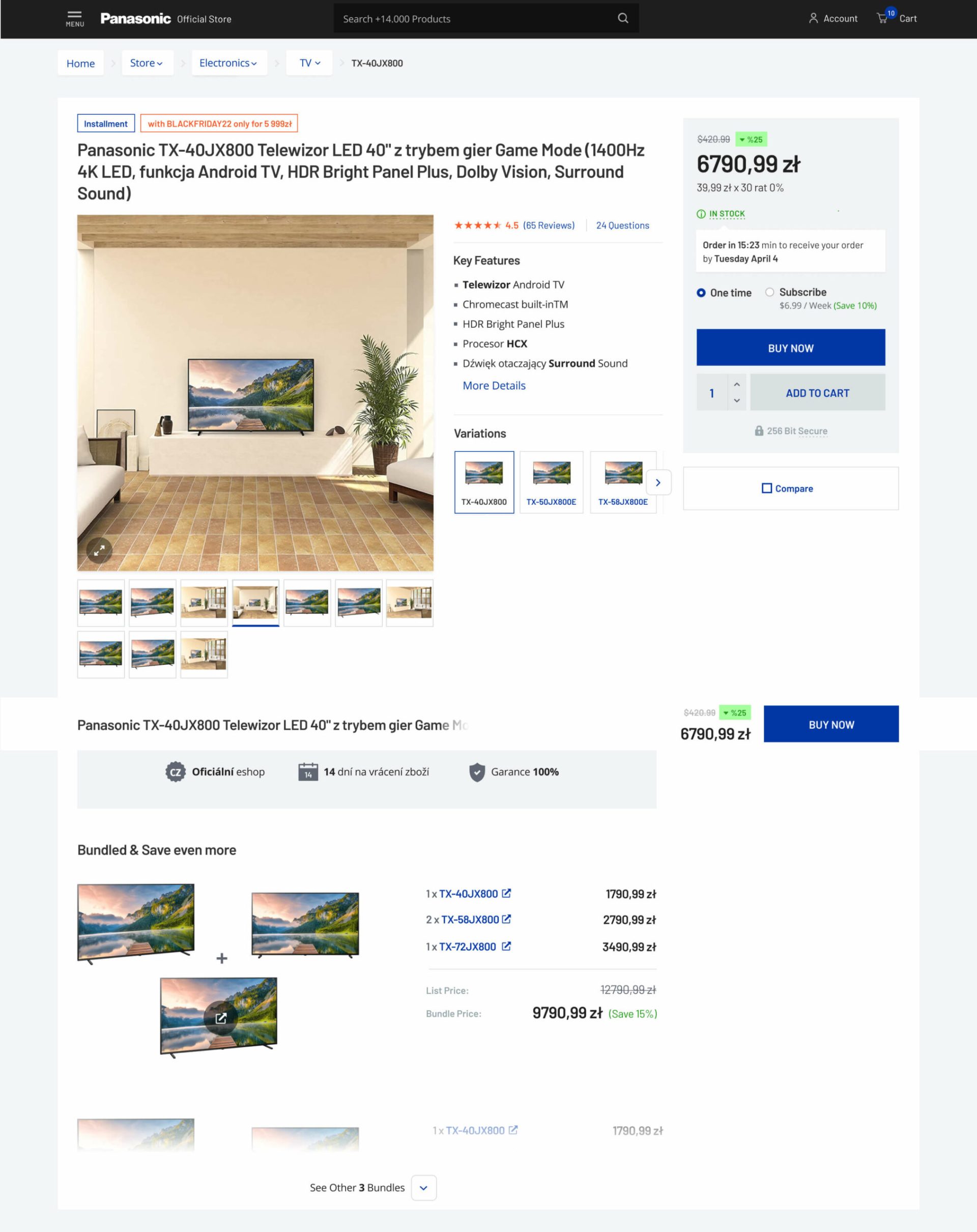
Panasonic Official Store

Embarking on a challenging endeavor, we, at Advise.co.uk, were entrusted with the ambitious task of creating an advanced digital solution for Panasonic, that complements their established brand guidelines.

Task

This project represented a bold departure from the status quo, a pioneering journey through the uncharted territory of design for a brand renowned for its quality and enormous stature. The goal: to retain the authentic spirit of Panasonic's brand while harnessing the power of web technologies to deliver a superior user interface and user experience (UI/UX) that would captivate audiences across the globe.

  • Design

    UI/UX Design, CRO Design

  • Client

    Panasonic

  • Digital Strategy

    Better User Experience & Revenue Optimization

  • Wordpress

    Wordpress Design

Project Details

1

Typeface

Guided by a reverence for Panasonic's rich brand heritage and an unwavering commitment to our innovative design ethos, we embarked on this journey with a dual mandate - to harmonize with existing guidelines and to infuse modernity into the brand's digital persona. Our first challenge lay in the realm of typography. Legal constraints prevented us from deploying Panasonic's usual DIN typeface. After thorough research, prototyping, and testing, we found our answer in Barlow, a contemporary font that retains the key characteristics of DIN. The minimalistic elegance and readability of Barlow allowed us to maintain the familiar and consistent aesthetic of the Panasonic brand, without infringing upon the rights of the original font.

2

Responsive Design

The second significant challenge was to revamp Panasonic's design to be responsive, flexible, and tailored for an increasingly mobile-first world. Initially, the brand was unprepared for this level of responsiveness, with constraints that reduced usability on smaller screens. Our objective was to redefine these parameters, maximizing the usage of available screen real estate while maintaining a clean, intuitive design.

3

Every Pixel Counts

One major step towards this goal was the re-imagination of the bar layout on responsive devices. Initially intended to be compressed, we realized the potential to unlock nearly 50% more usable space by expanding the bar's reach. This innovative design decision helped to enhance both aesthetics and functionality, breathing fresh life into Panasonic's digital brand image. In an environment where every pixel counts, we were determined to leverage every corner, all without compromising the brand's style guidelines or user navigability.

4

Category - Products

The category and product pages were further streamlined for an efficient and engaging browsing experience. The product list, traditionally a mainstay on these pages, was hidden, reducing clutter and allowing the products to take center stage. We introduced a sleek menu icon next to the logo, transforming the navigation process into a journey of discovery, smoothly guided by breadcrumbs that lend context and direction.

5

Speed Matters

One of our crowning achievements was the introduction of an immediate results display, as soon as any option is selected. This eliminated unnecessary wait times, creating a highly responsive, engaging, and seamless browsing experience that leaves a lasting impression.

6

Thank you Panasonic!

Our collaboration with Panasonic has been a journey of harmonizing heritage and innovation, meticulously crafting a UI/UX that meets the brand's rigorous standards while pushing the boundaries of digital design. The result is a web presence that is not just an afterthought, but an integral part of the Panasonic brand - an exquisite manifestation of the brand's ethos, engineered for the digital age. Today, Panasonic's digital identity stands as a testament to the power of thoughtful design, where every pixel tells a story, every interaction is a delight, and every user leaves with a lasting memory of a brand that truly understands and values their digital experience.

Let's Collaborate

Got a project?

Back